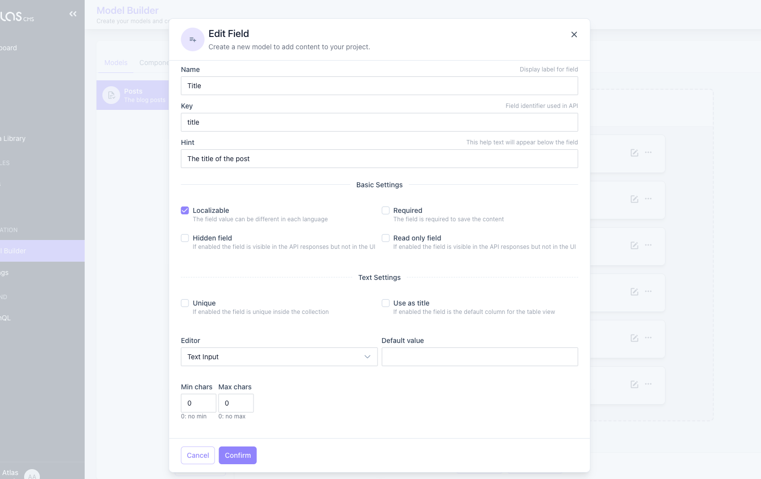
Fields
Each field has common properties you can edit when you add a field or also after it has been created.
| Property | Description |
|---|---|
| Name | The label of the field shown on the edit of a content |
| Hint | (optional) A help text |
| Key | The name of the field in the API responses |
| Enable Localization | If the field can be localized. If false changing the value of the field will replace the value on all available languages of the content |
| This field is required | If the field is mandatory |
| Hidden Field | Hides the field from the UI, but it will be available via API |
| Read Only | Show the field in the UI in read-only mode, but it will be available via API |
TIP
Each type of field can have other settings or validation that depends on the specific field type. The following sections describe the specific settings per each field and their behaviours in the API request/responses.
Text
The simplest type of field. It renders an Input Field or a Text Area based on settings.
- Unique: (Rule) The value of the field must be unique inside the collection
- Use as title: This field is used as the value of rows when selecting the content from a relations field
- Default Value: The default value of the field
- Editor: The editor to use while editing contents. Can be a Text Input or a multiline Text area
- Number of chars: (Rule) The min/max number of chars allowed
Rich Text
It renders an input box for rich content editing.
- Editor: The editor to use while editing contents. Can be HTML or Markdown
- Number of chars: (Rule) The min/max number of chars allowed
Number
It renders an input box that allows only digital inputs.
- Default Value: The default value of the field
- Type: Integer or Decimal
- Range: (Rule) The min/max number allowed
Yes/No
A boolean field, that renders a switch input.
- Default Value: The default value of the field. Can be true, false, 1 or 0
Date
It renders a Date Picker input.
TIP
Doesn't have extra settings
Date & Time
It renders a Date & Time Picker input.
TIP
Doesn't have extra settings
Time
It renders a Time Picker input.
TIP
Doesn't have extra settings
Single Choice
The single choice field allows you to select an element from a list of predefined values. It renders a Radio Button List or a Select based on settings.
- Editor: Select or Radio Button
- Values: The list of predefined values. Each row represents a value
Enumeration
The enumeration field allows you to select 1 or multiple elements from a list of predefined values. It renders a Checkbox List or a Multi Select based on settings.
- Editor: Checkboxes or Multi select
- Values: The list of predefined values. Each row represents a value
- Min/Max Selection: (Rule) The min/max number of selectable elements
Tags
It renders a Tagged input.
- Min/Max Selection: (Rule) The min/max number of Tags allowed
Media
It renders a Media Selector Modal to select an asset from the Media Library.
TIP
Doesn't have extra settings
Media Gallery
It renders a Media Selector Modal to select multiple assets from the Media Library.
TIP
Doesn't have extra settings
Color Picker
It renders a Color Picker input to visually select a color in HEX format.
TIP
Doesn't have extra settings
Map
It renders a Leaflet Map with the option to search by location or by coordinates.
TIP
Doesn't have extra settings
Key/Value
It renders repeatable Key/Value input text fields.
TIP
Doesn't have extra settings
Value Array
It renders repeatable Text input fields.
TIP
Doesn't have extra settings
Json
It renders a code editor control with syntax highlight and formatting.
Json Fields are useful in all situations where you need to store a custom structure of data and retrieve it as a Json Object instead of a string or other primitive types.
TIP
Doesn't have extra settings
Relations
It renders a table to manually select related contents of other models.
- Allowed Type: The type of content allowed
Component
It renders the controls defined in a component.
- Allowed Type: The component allowed
Multi Components
It renders a repeatable and orderable list of components.
- Allowed Types: The types of content allowed